L'ORÉAL PUREOLOGY
Challenge:
To revitalize the Pureology haircare line with a completely new aesthetic and improved functional attributes.
Solution:
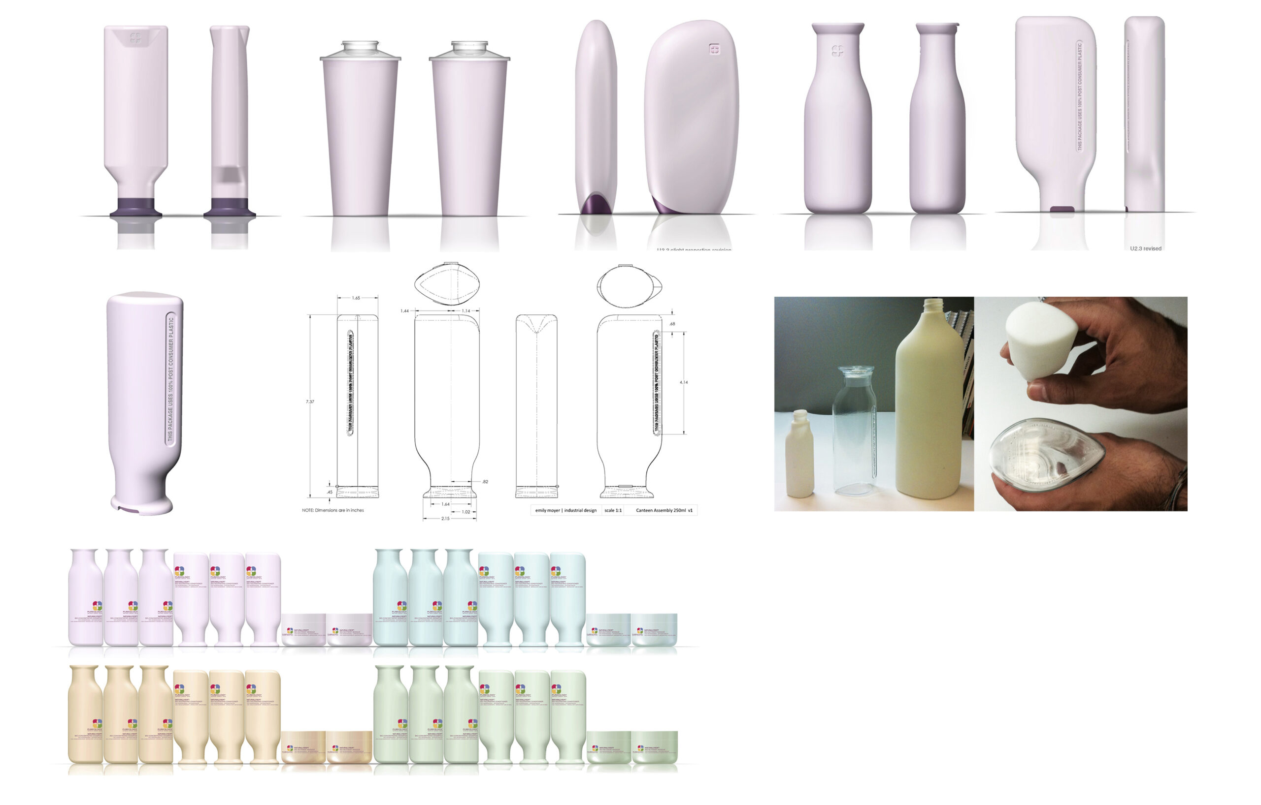
A soft, nature-inspired, structural design with a wider neck to deliver the product with ease. This 3D visual brand language was designed to reflect the purity of the product contents, and to highlight the use of post-consumer recycled materials.
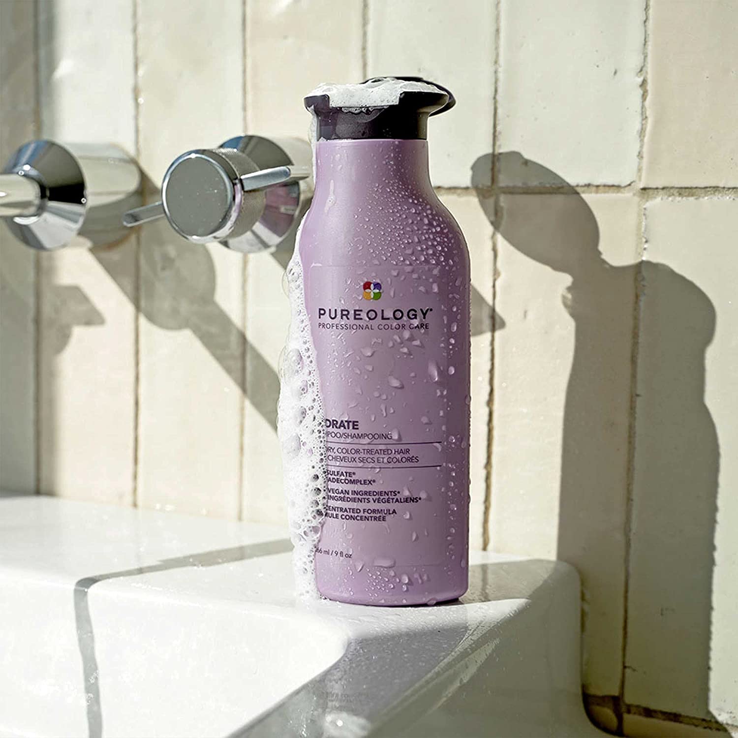
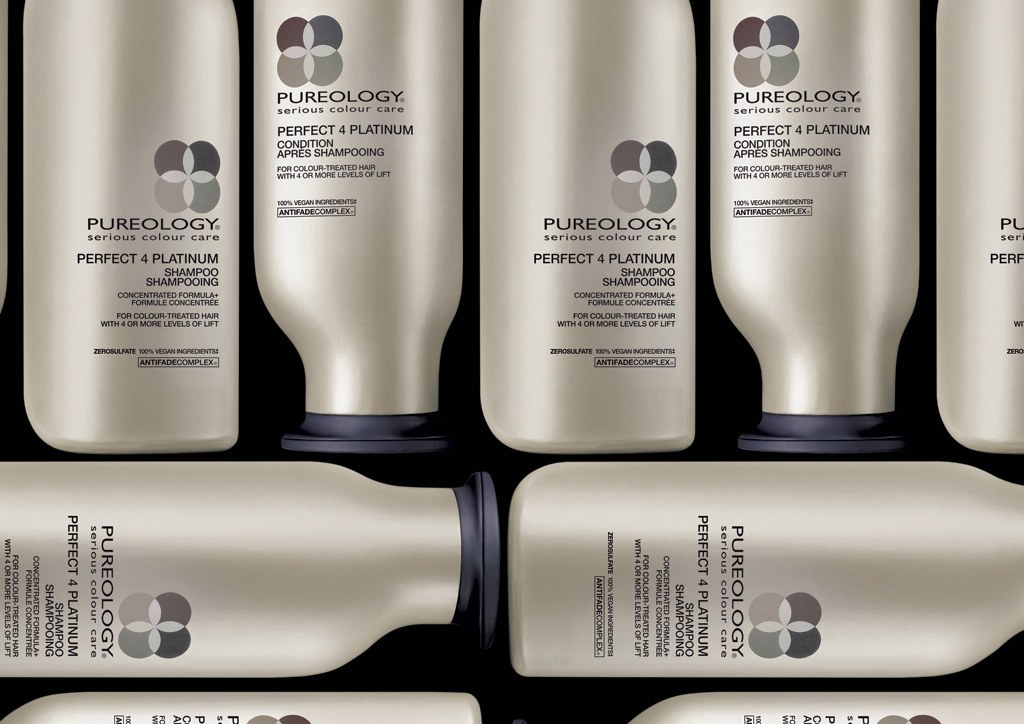
Functional benefits:
The wide mouth and large orifice allow easy evacuation/flow and filling of the product. The flip cap with large flange creates a simple one-handed operation. The ability to place the container down on it's foot or head provides both no-fuss flexibility, as well as insuring that the product can be readily accessible and can evacuate fully with no waste.
Environmental benefits:
The bottle’s efficient two-part construction can be easily broken down and recycled. The use of post-consumer plastic reduces the impact on the environment, while maintaining the functional benefits of plastic: squeeze-ability, impact resistance, performance in wet environment, etc. There is little wasted space when containers are nested, providing efficiency in shipping and on-shelf.
*Inspired by my design for 360 Paper Bottle, L'Oréal sought me out to bring a similar aesthetic to Pureology.
Selected Works
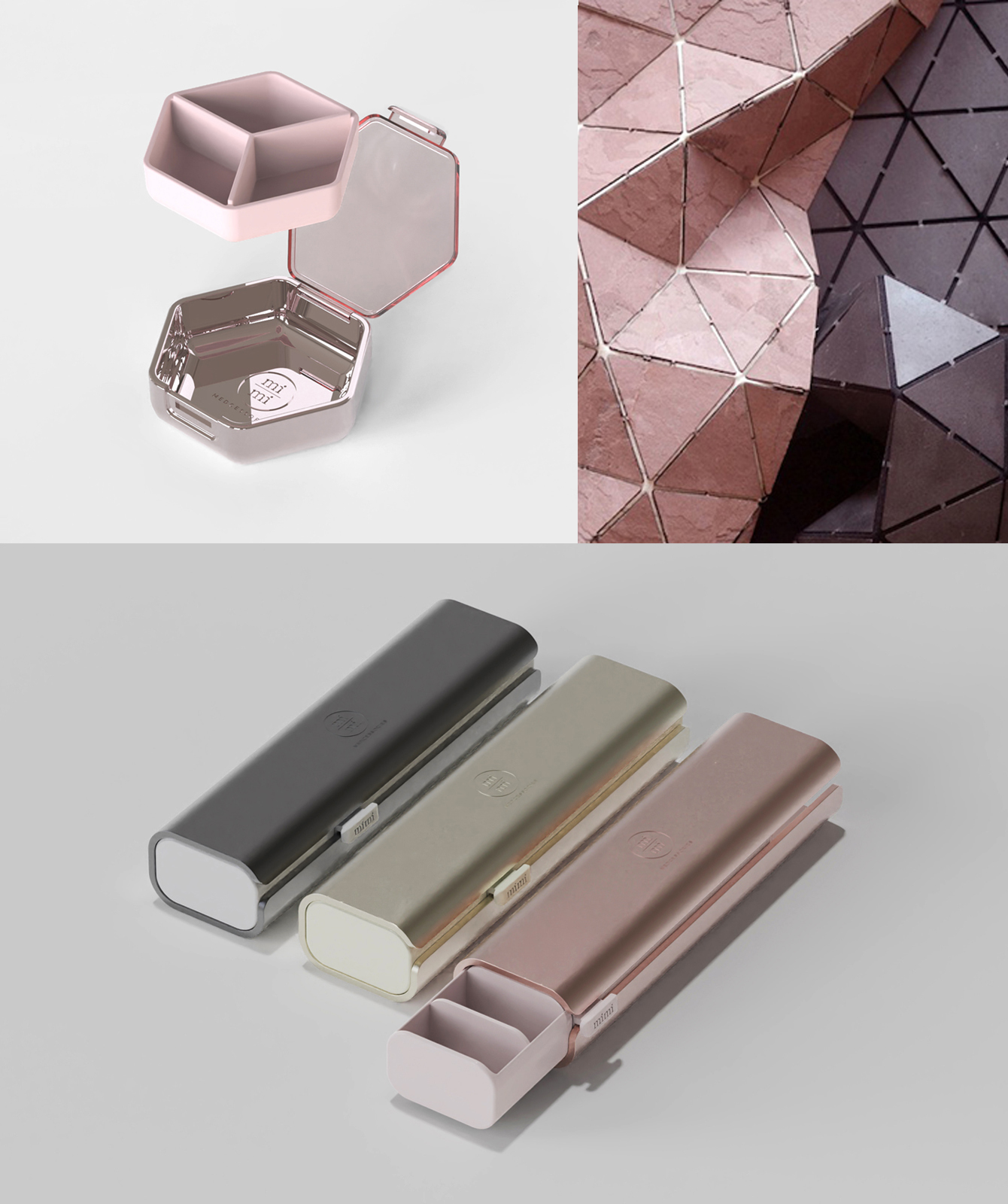
Mimi MedcessoriesInnovation Strategy | Product Line Design | Technical Implementation
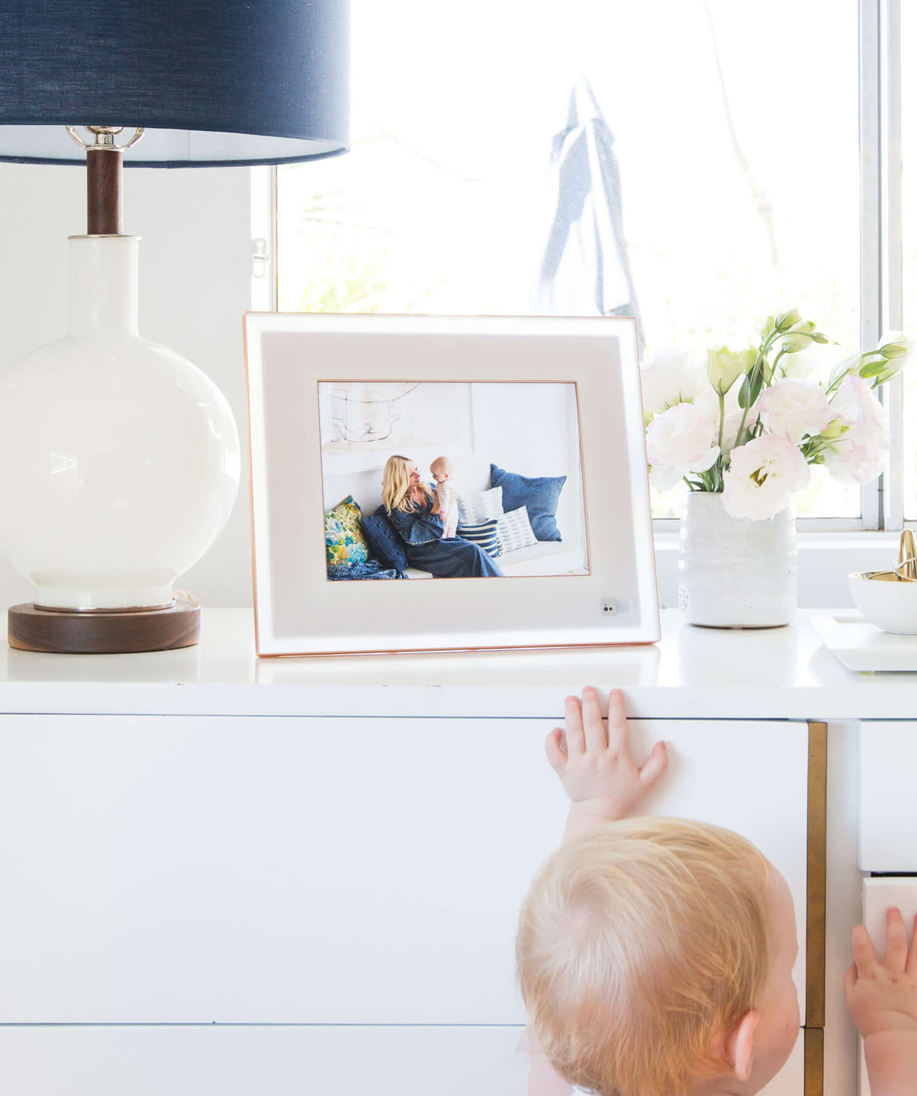
Aura HomeBrand Creation | Innovation Strategy | Product & Package Design | Technical Implementation
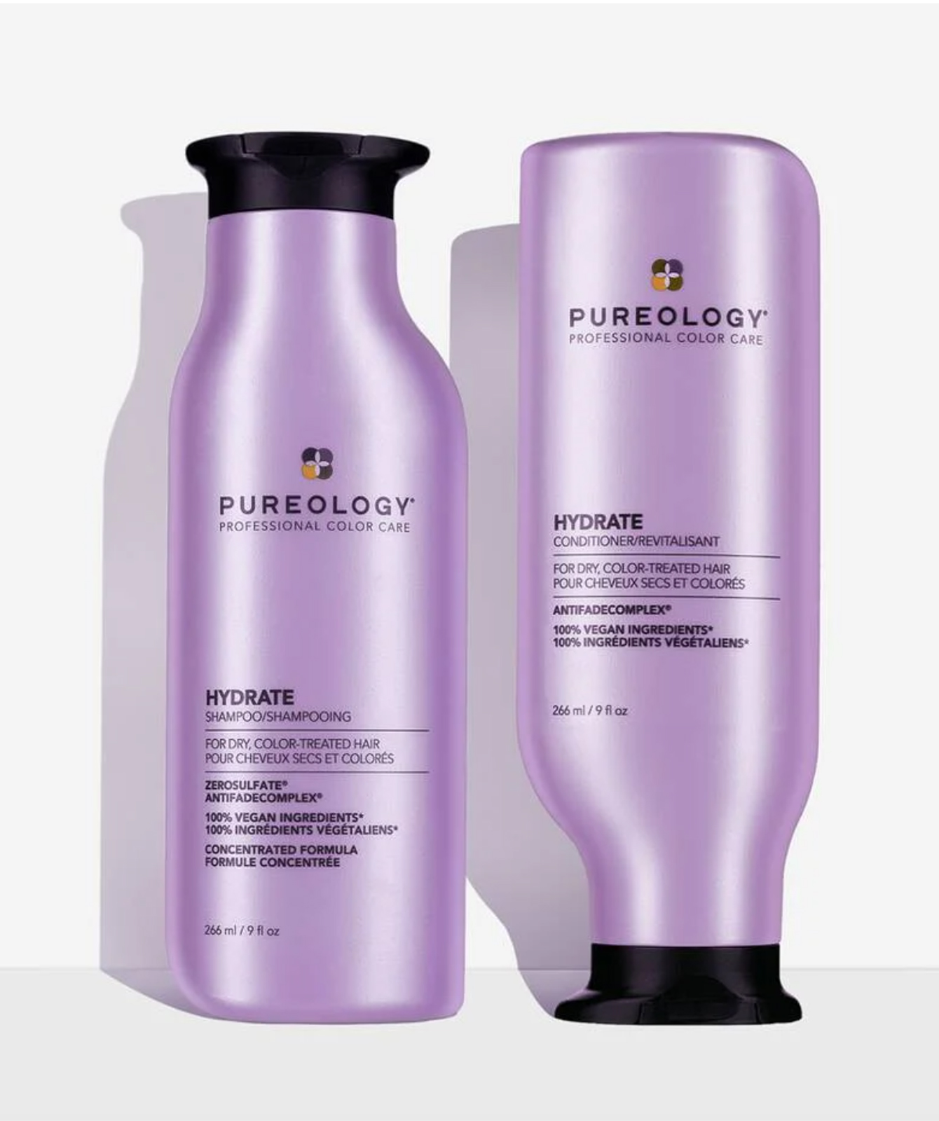
L'Oréal PureologyBrand Renewal | Structural Packaging Design | Technical Implementation
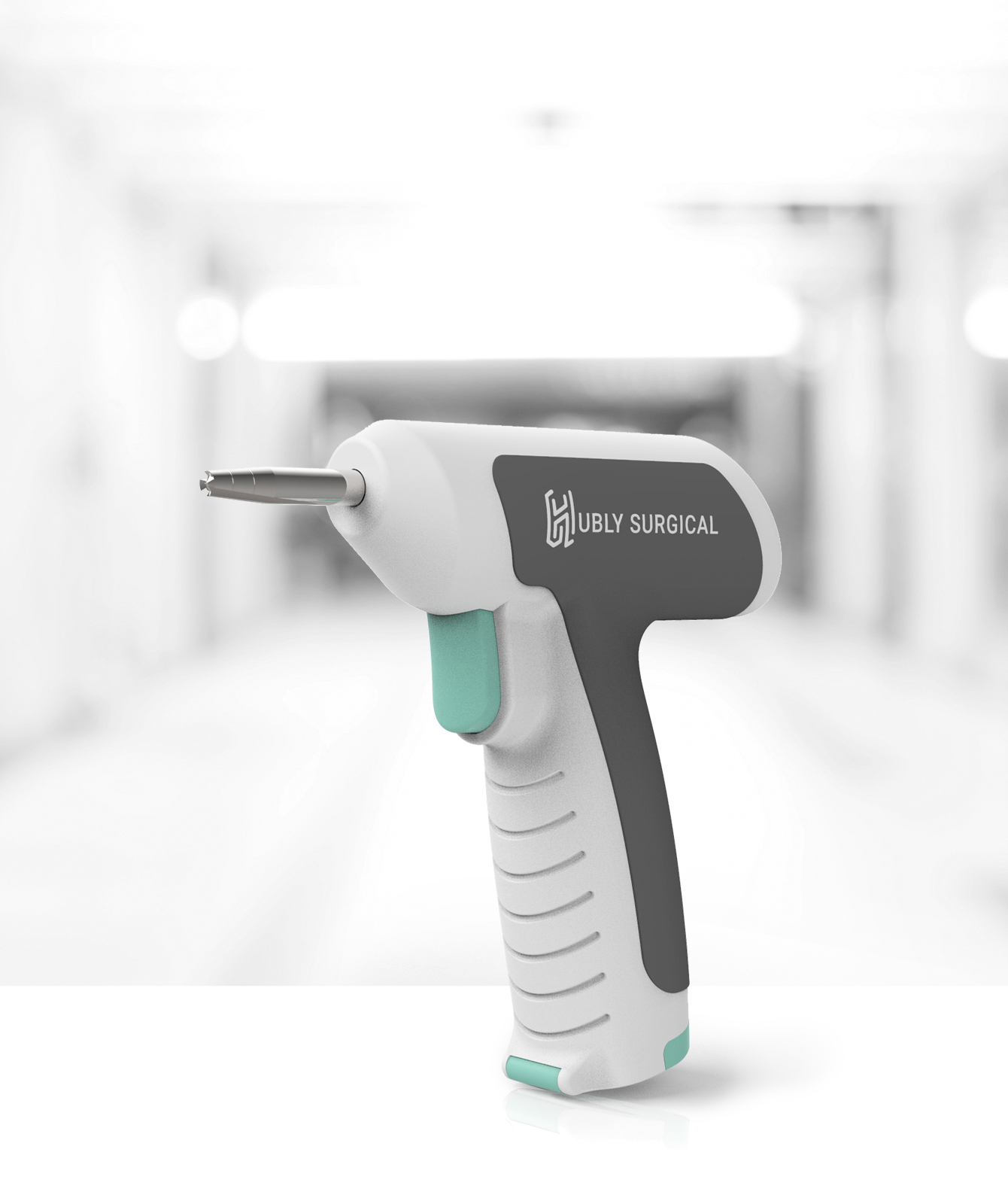
Hubly Surgical DrillDesign Strategy | Groundbreaking Product Design | Technical Implementation
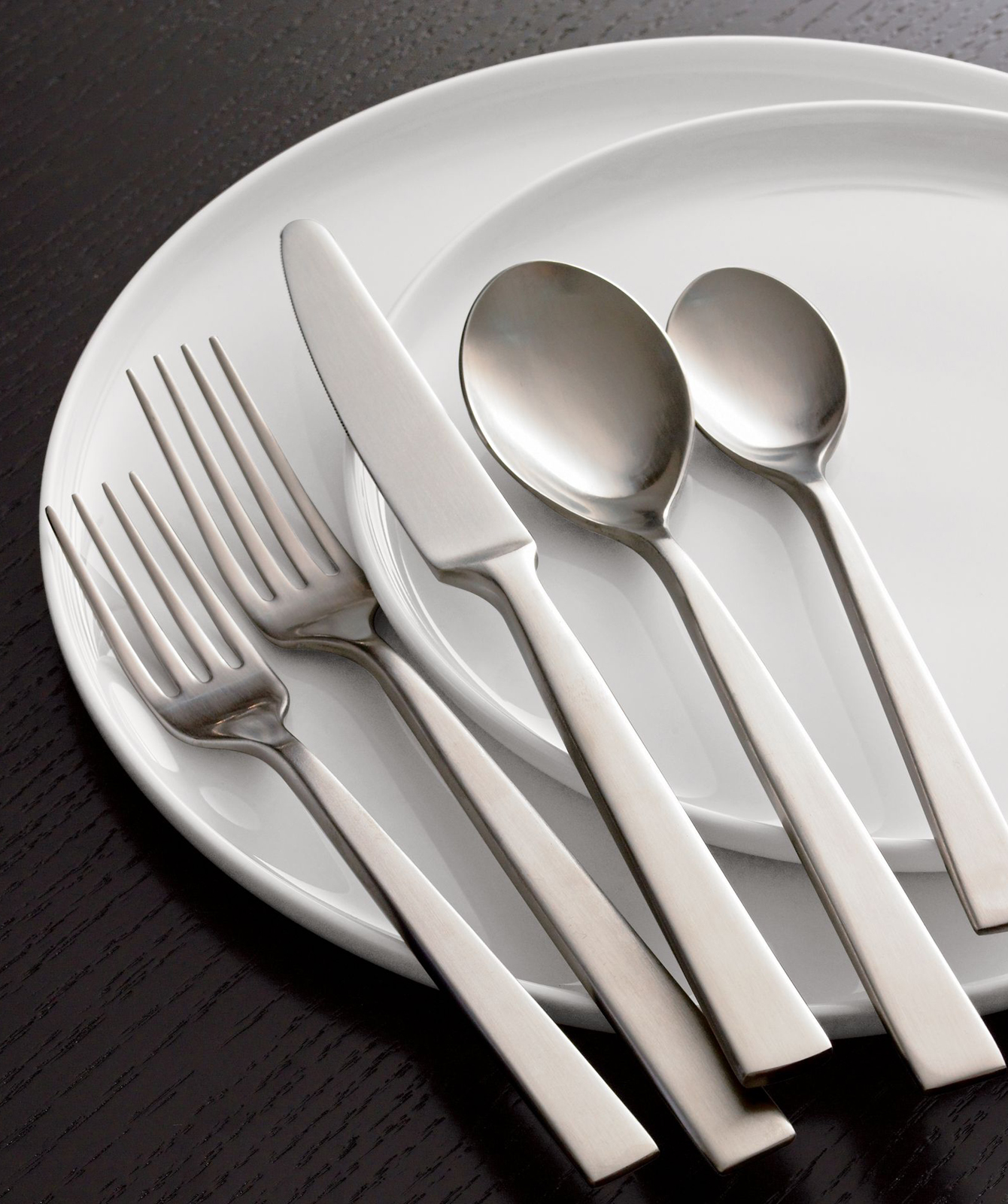
Cambridge SilversmithsProduct Design | Technical Implementation
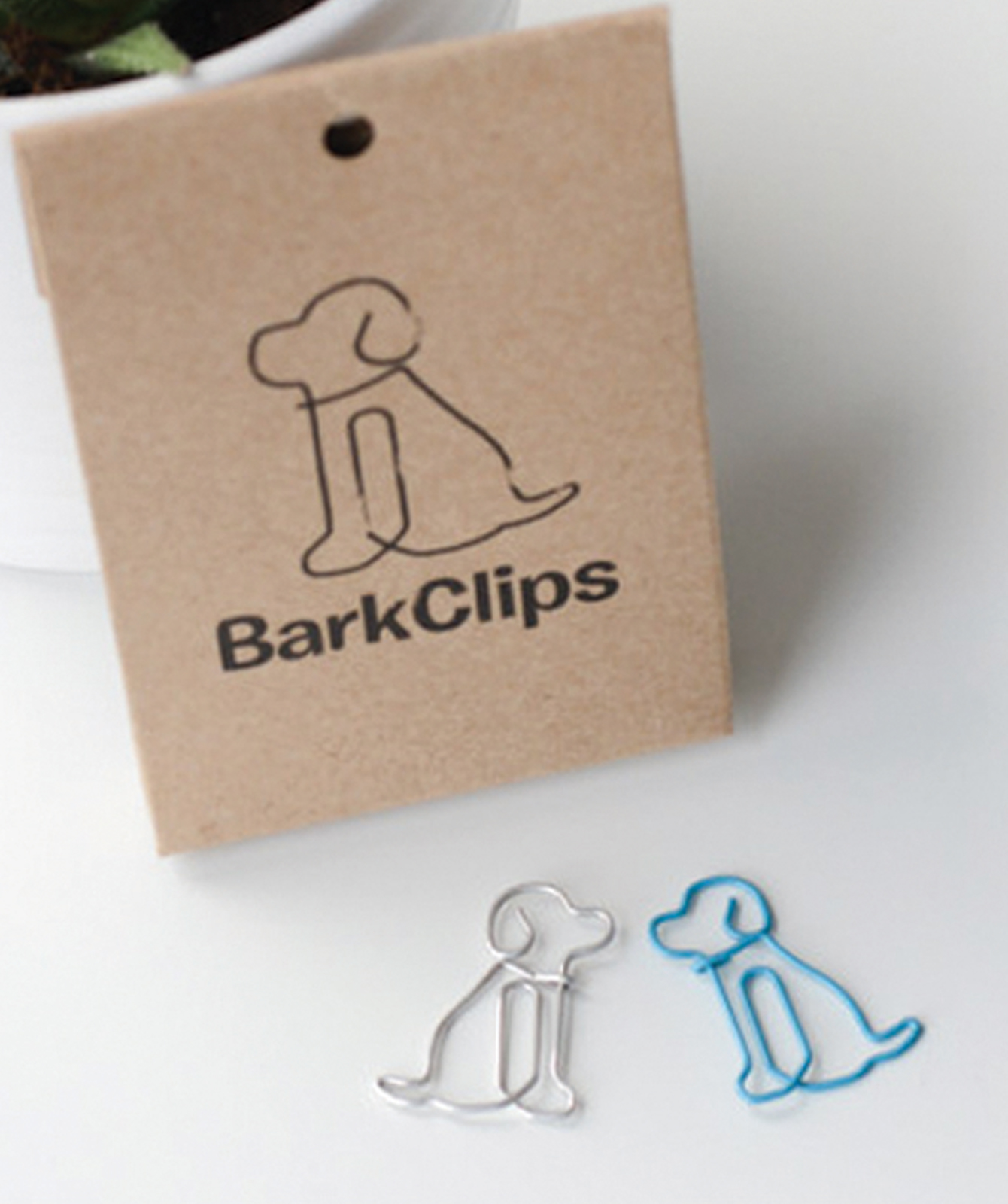
BarkClipFirst Proprietary Product for Brand | Product Design
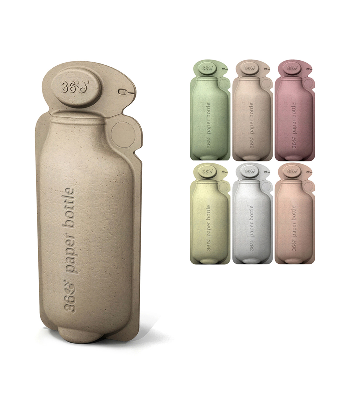
360 Paper Water BottleSustainability Research | Innovation Strategy | Concept Design
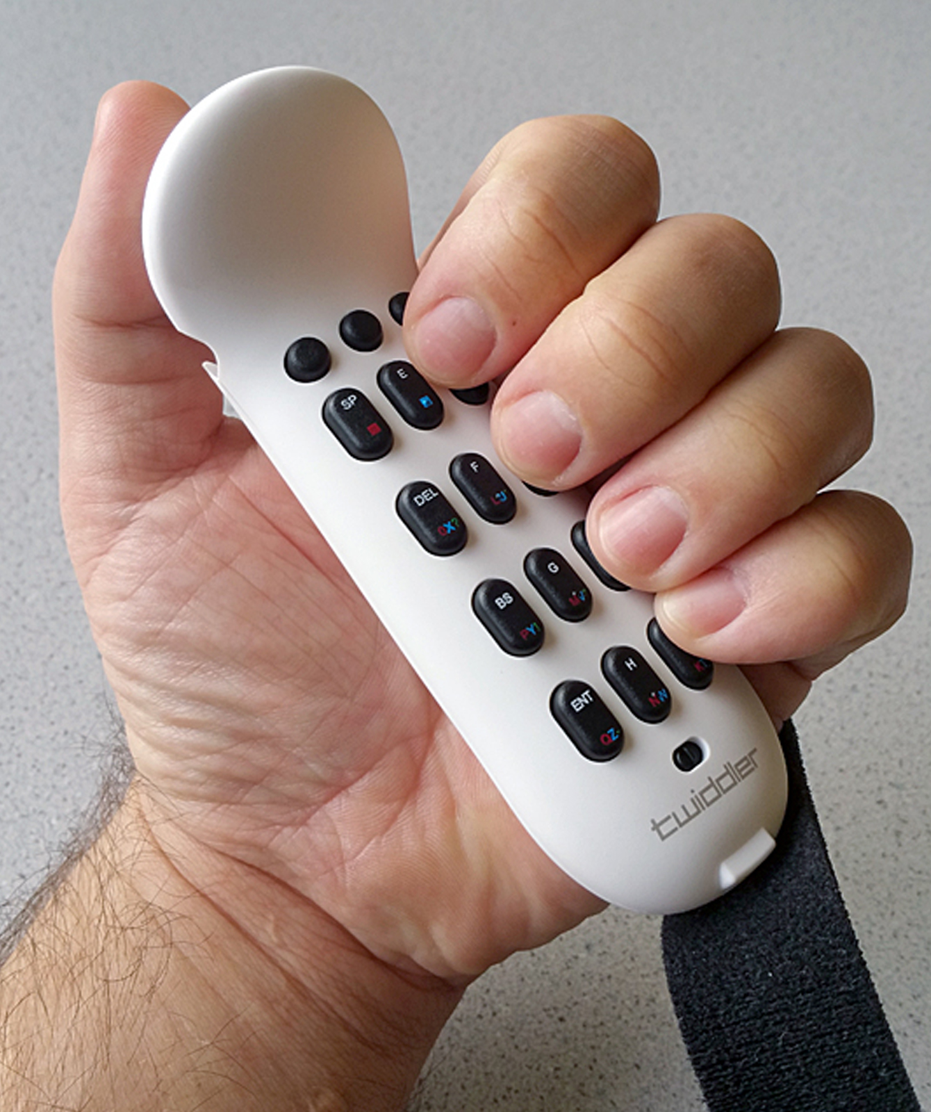
Twiddler by TekGearUser Centered Research | Design Strategy | Product Redesign
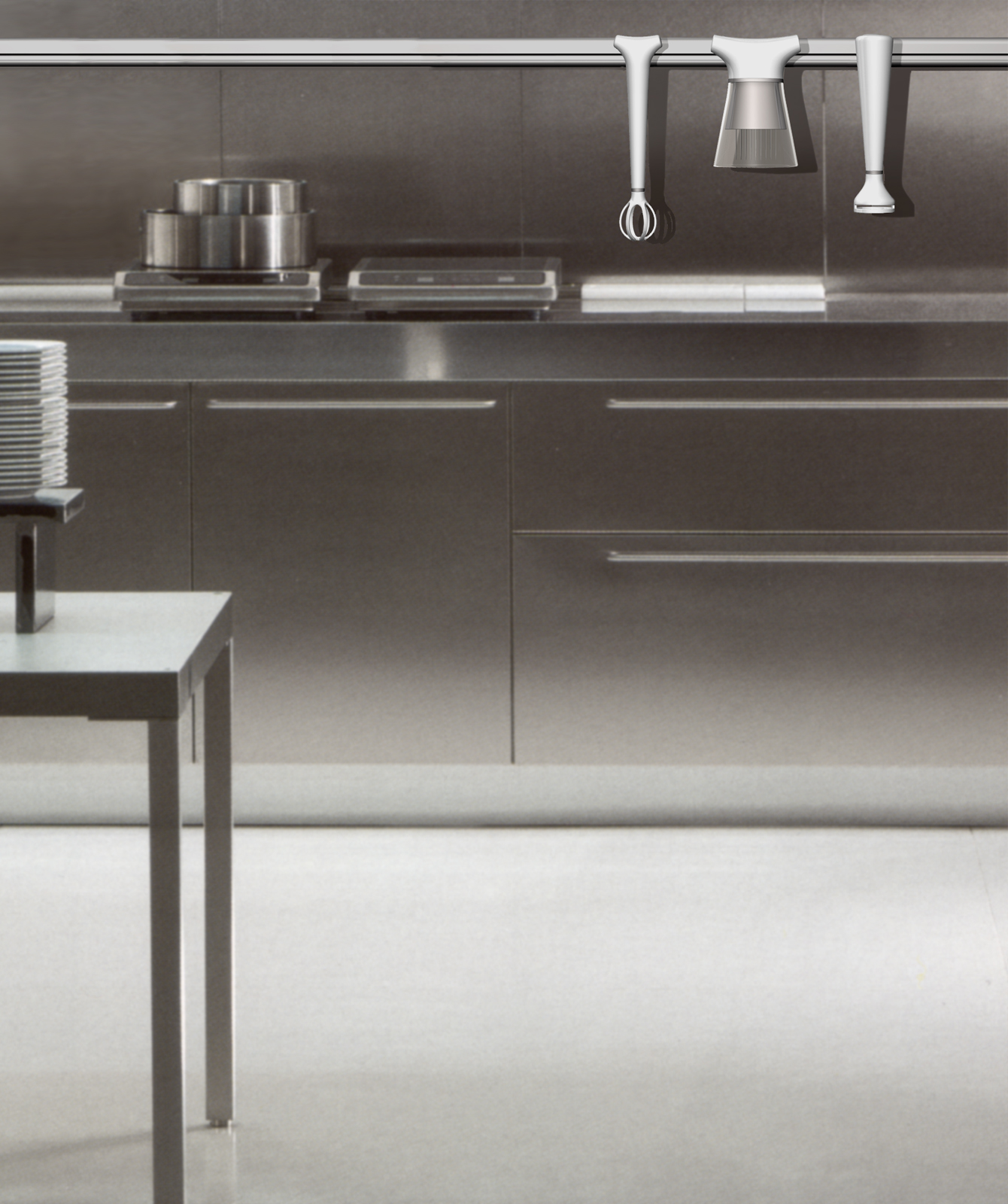
ElectroluxBrand Extension | New Product Line Design
